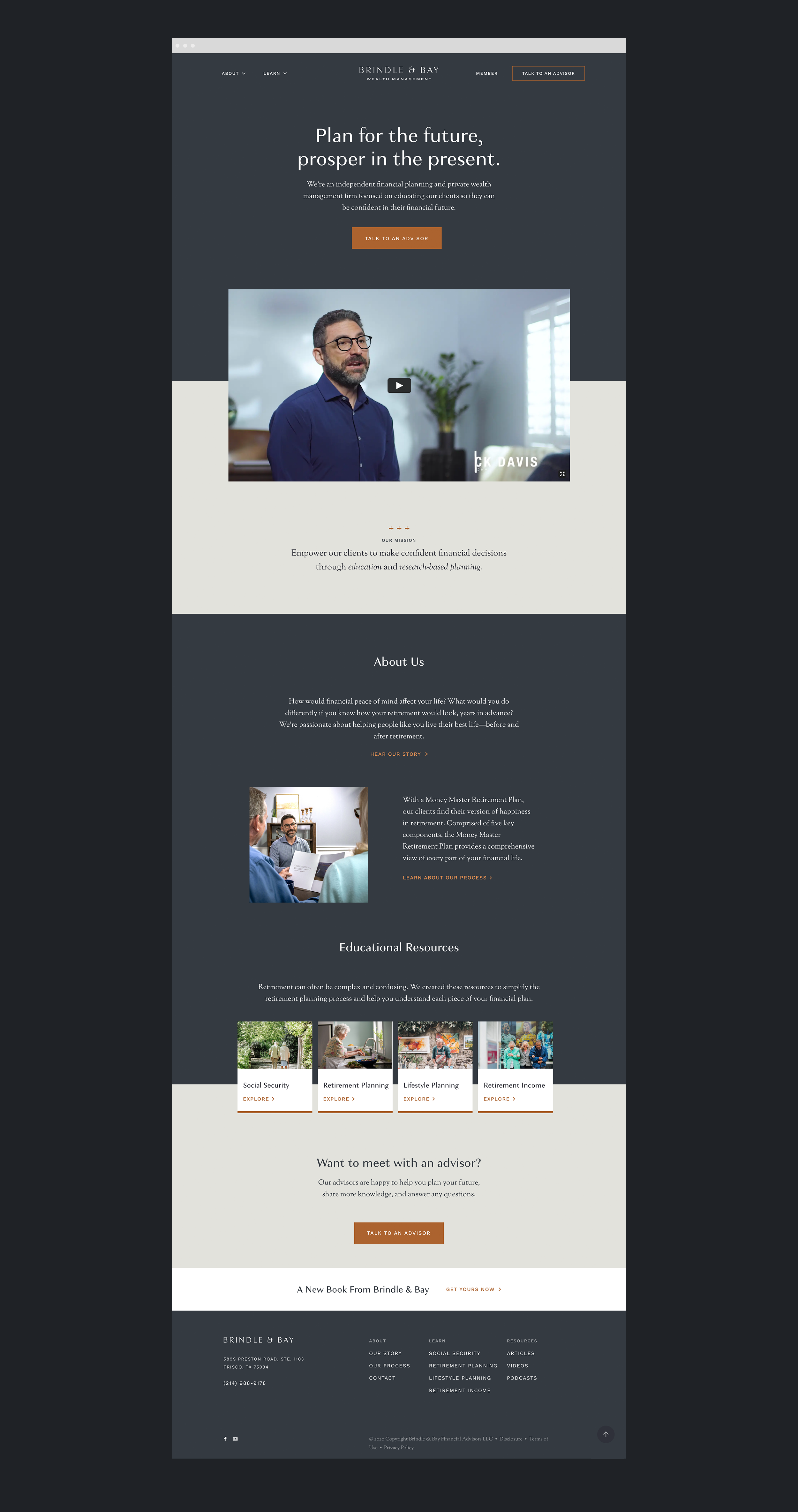
Brindle & Bay: Independent financial planning on the Texas prairie.
Guiding Texans through the financial planning process since 2012. brindleandbay.com
Disciplines
NamingBrand strategyBrand identityCreative direction
Website
Packaging
Copywriting
Summary
Nick and Connie Davis approached my team to help them refresh the identity of their financial advisory firm, Stonebridge. While a complete brand overhaul wasn’t initially intended, our early market research made it clear that’s what was needed—we uncovered a number of competing independent advisors within Nick and Connie’s service area, also named Stonebridge, and with very similar visual identities. With a modern approach to financial planning and deep, Texas roots (including Nick’s previous life as both a pastor and rodeo clown), it was obvious that a new brand would need to marry country sensibilities with a modern aesthetic. Ultimately, we were inspired by the land itself.
Frisco, Texas, where Nick and Connie live and work, sits atop what was once a 20,000 sq mi sprawl of grassland known as the Blackland Prairie. It’s considered one of the most fertile land areas on Earth. We found evidence of what would be an unfathomable sight today but was very much a real thing in the early 1800s—tens of thousands of wild horses grazing across the prairie.
We created Brindle & Bay with this image in mind. "Brindle" being the rarest horse color and "bay" the most common, the name evokes the beauty and diversity one might witness when viewing this fabulous herd while also referencing the breadth of financial circumstances serviced by the firm.
Of course, a non-traditional name deserved a non-traditional visual identity. Unlike most brands in the space, we wanted Brindle & Bay to feel more human, warm and accessible. Color, type, and voice are all reflections of Nick and Connie’s hospitable nature and commitment to service excellence.
Contributors
Christine Kim, Sr. Designer
Linny Cramer, Sr. Designer
Taylor Brandon, Photography


